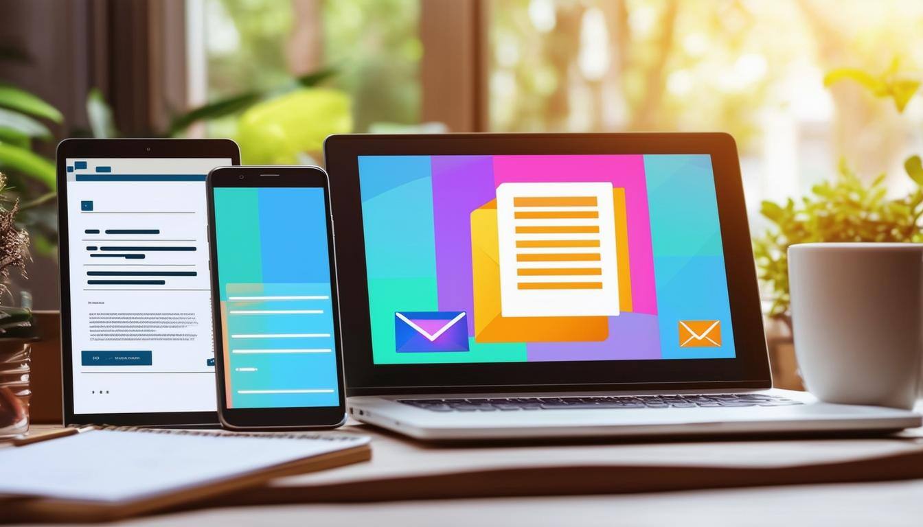
In today’s mobile-first world, responsive email design is a non-negotiable for any successful email marketing campaign. With users accessing their emails across various devices and screen sizes, ensuring your emails look great and function seamlessly everywhere is critical. This guide offers actionable tips to help you design responsive emails that deliver exceptional user experiences and boost engagement.
1. Use a Mobile-First Approach
Designing with mobile users in mind ensures your emails are accessible to the largest audience.
- Key Tips:
- Prioritize single-column layouts for readability on smaller screens.
- Use a minimum font size of 14px to ensure text is legible without zooming.
- Test emails on popular devices to ensure a consistent experience.
2. Choose Flexible Layouts and Images
Dynamic layouts adapt to different screen sizes, enhancing visual appeal.
- Design Tips:
- Use percentages rather than fixed pixels for widths.
- Opt for responsive images that scale with screen size.
- Implement breakpoints using CSS media queries to optimize layouts.
- Simplify Your Email Design
A clutter-free design improves usability and boosts readability.
- Best Practices:
- Keep email content concise and scannable.
- Avoid stacking too many elements or images.
- Use clear headings and subheadings to organize information.
4. Optimize Your Call-to-Actions (CTAs)
A responsive CTA ensures maximum click-through rates.
- CTA Essentials:
- Use buttons that are at least 44px by 44px for easy tapping.
- Place CTAs above the fold and repeat them for longer emails.
- Use bold colors and compelling action words to drive engagement.
5. Focus on Readable Typography
Readable text enhances comprehension and user engagement.
- Typography Tips:
- Stick to web-safe fonts like Arial, Verdana, or Georgia.
- Use contrasting colors for text and background to improve visibility.
- Maintain a comfortable line height of 1.4 to 1.6 for easy reading.
6. Test Emails Across Devices and Clients
Comprehensive testing ensures a consistent experience.
- Testing Tools:
- Use platforms like Litmus or Email on Acid to preview emails on various devices and clients.
- Check for rendering issues, broken links, and load times.
- Test email deliverability to avoid landing in spam folders.
7. Ensure Fast Loading Times
Slow-loading emails frustrate users and reduce engagement.
- Speed Optimization:
- Compress images and avoid heavy file sizes.
- Use inline CSS instead of external stylesheets.
- Minimize the use of unnecessary code and scripts.
8. Include Alt Text for Images
Alt text ensures accessibility and improves user experience.
- Why It Matters:
- Users with slow connections or disabled images can still understand your email.
- Alt text enhances accessibility for visually impaired users.
- It provides a fallback in case images fail to load.
9. Don’t Forget Accessibility
Emails should be inclusive for all users.
- Accessibility Tips:
- Use descriptive subject lines for context.
- Include proper HTML tagging for screen readers.
- Offer a plain-text version of your email for better compatibility.
10. Stay Consistent with Branding
Responsive emails should align with your brand identity.
- Branding Tips:
- Use your brand colors and logo prominently.
- Maintain consistent fonts and imagery across emails and web content.
- Ensure the tone and voice align with your overall marketing strategy.
Contact Theia Media Agency to Schedule Your Free Marketing Strategy Session
Responsive email design is key to engaging audiences in a world where devices vary significantly. By prioritizing readability, usability, and accessibility, you can ensure your emails look stunning and perform seamlessly across all platforms.
At Theia Media Agency, we specialize in creating email campaigns that deliver results. Whether you're building your first email list or refining an existing strategy, we’re here to help. Schedule a consultation today through our website form and watch your email marketing soar!